November 28,2025
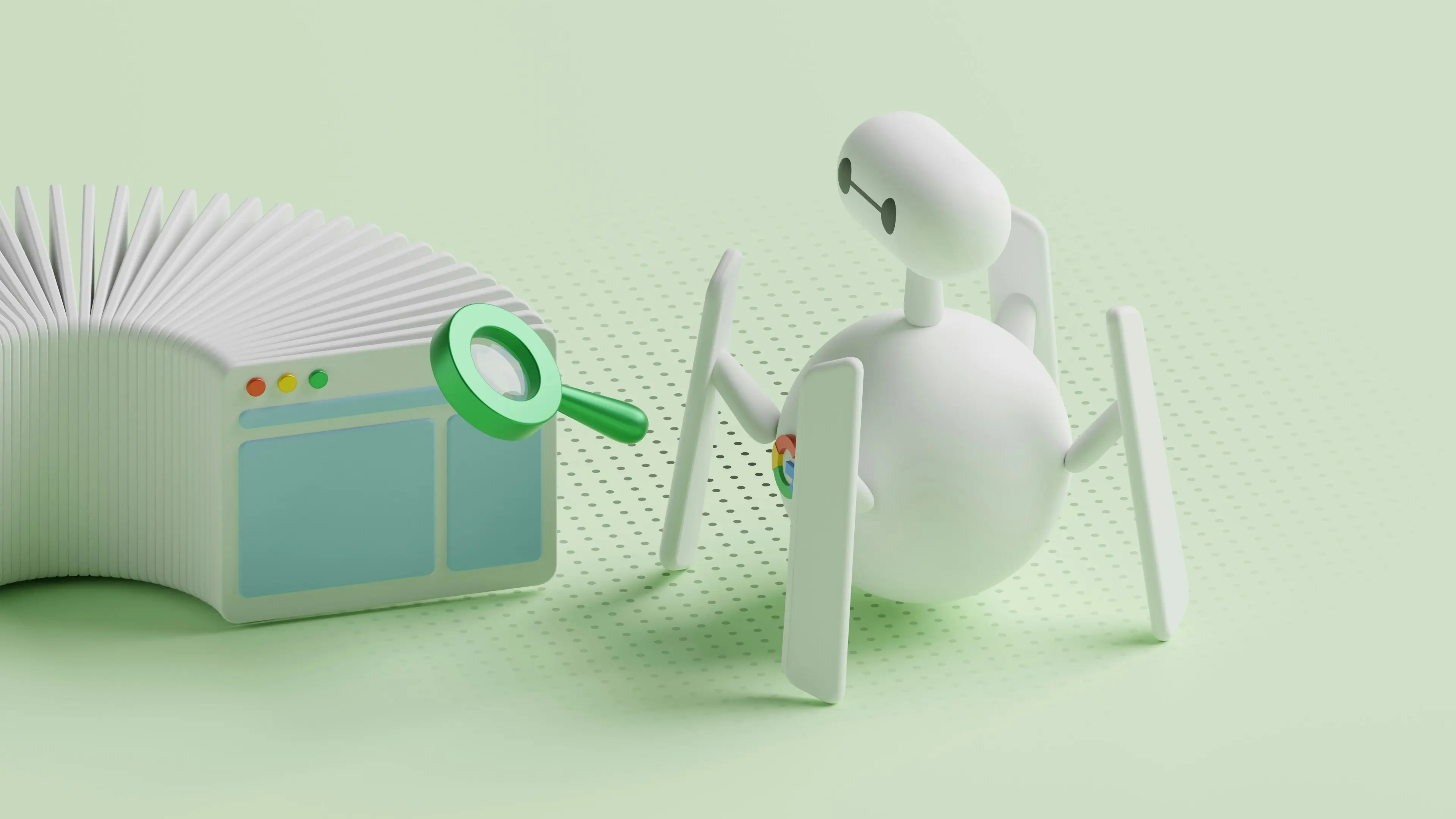
What Website Design Strategy Is Best?
The best website design strategy combines clean, modern visuals with a clear structure, strong storytelling, mobile-first layouts, fast performance, and user-friendly navigation. In other words, the winning approach is a blend of beautiful design + intentional UX that makes your website look professional, feel trustworthy, and guide users naturally through the experience.
Everything else—SEO, conversions, accessibility, branding—flows from this foundation. Now let’s break down what that actually means in practice.
What Makes a Website Design Strategy “The Best”?
1. Beautiful Design Paired With Clear Purpose
A website shouldn’t be just visually pleasing or just strategic—it needs both. At Esper Creations, we believe modern design elements (clean layouts, refined spacing, strong typography, brand-aligned colours, good imagery) are essential for building trust and shaping first impressions.
But design must also have direction. Users should know:
- Where they are
- What you do
- Why you’re the right choice
- What they should do next
This blend of aesthetics + clarity is the core of our design philosophy.
2. The Most Important Section: A Story-Driven Hero
Why is the hero section the centrepiece of our strategy? Because it is the first thing users see—and it sets the tone for the entire experience.
A great hero section should:
- Tell your brand’s story in one glance
- Communicate your main value
- Connect emotionally through design and visuals
- Showcase professionalism
- Guide users toward action
Most businesses underestimate its importance. At Esper Creations, we treat it as the signature moment of the website.
3. Mobile-First, Not Mobile-Second
With most users browsing on phones, mobile design can’t be an afterthought. A mobile-first strategy ensures:
- Buttons are tap-friendly
- Typography is readable
- Spacing feels comfortable
- Design stacks naturally
- Speed remains high
- Navigation is simple
A website is only as strong as its smallest screen experience.
4. Balanced, Minimalist Layouts That Feel Modern
Minimalism isn’t about removing design—it’s about removing noise. When layouts are simple, users:
- Understand the brand faster
- Notice what matters
- Trust the visuals more
- Stay longer
- Enjoy the website experience
Clean design also loads faster and feels more premium.
5. High-Quality Design Elements That Build Trust
A website’s perceived quality increases dramatically when the design includes:
- consistent typography
- branded colours
- polished icons
- professional imagery
- a well-structured grid
- smooth spacing
- balanced visual hierarchy
These elements make a brand feel stable, credible, and established—even if they’re small details.
6. Fast Performance That Supports the Experience
Performance isn’t just technical—it impacts the feel of your design. Esper Creations uses:
- lightweight media
- optimized images
- clean code
- modern frameworks like Next.js & TailwindCSS, Wordpress also.
- caching & compression
- mobile optimisation
Fast load times make great design feel even better.
7. Industries That Thrive With This Strategy
The beautiful + strategic design approach works especially well for:
- Restaurants (visual appeal = appetite & trust)
- Tradespeople (professional design = credibility)
- Local services (clean design = clarity + bookings)
- E-commerce stores (product visuals = sales)
- Businesses needing custom builds (polished UI = authority)
When design looks good and functions smoothly, customers make decisions faster.
8. One Common Mistake: Overdesigned Websites
Before working with Esper Creations, many clients had websites that:
- used too many colours
- had mismatched fonts
- included oversized animations
- felt cluttered
- used low-quality images
- tried to “look cool” but didn’t feel cohesive
The result? Visitors felt confused or overwhelmed. Clean, modern, professional design always outperforms “creative chaos.”
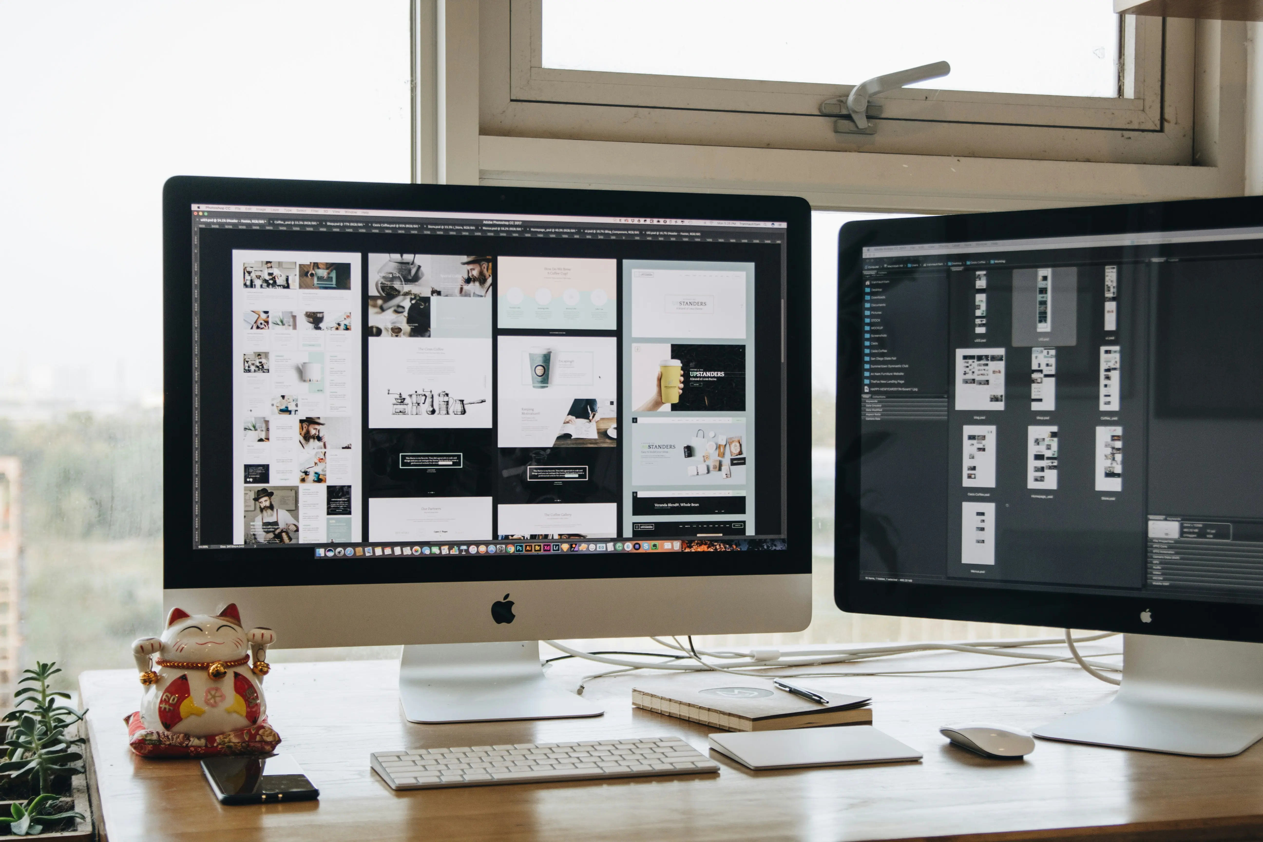
9. Our Go-To Design Toolset
To deliver modern, polished websites, Esper Creations uses:
- Figma
- Photoshop
- Design systems
- Grid layouts
- Brand guideline creation
Design Tools
- TailwindCSS
- Nextjs
- WordPress
Development Tools
- Google Analytics
- Heatmaps
- Device testing
- SEO structure planning
User Experience Tools
This combination ensures visual excellence and usability go hand in hand.
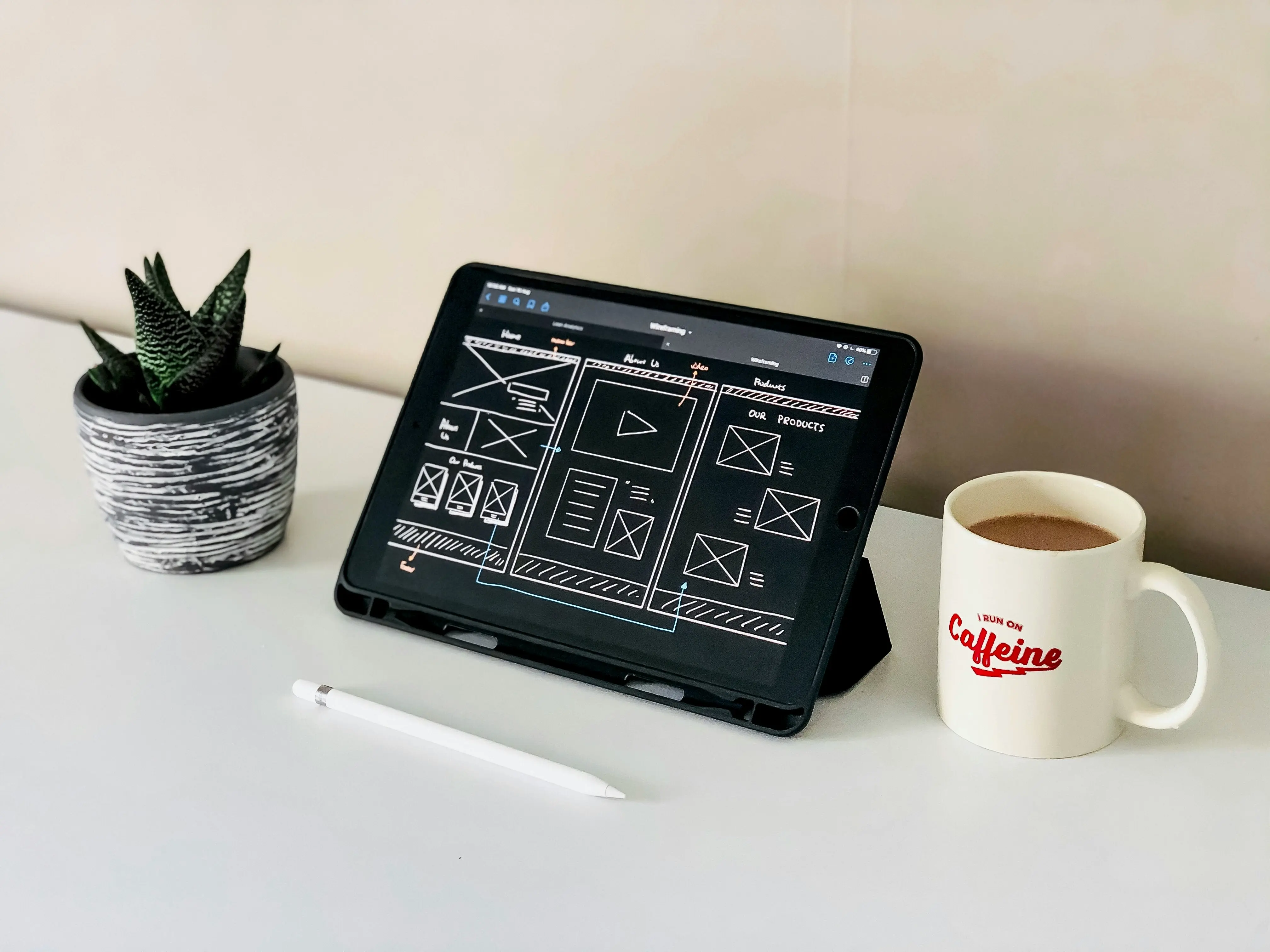
10. What the Perfect Website Includes (Visual + Structural)
Below is the exact structure Esper Creations aims for when crafting a polished, professional site:
- Header: Clean navigation • Modern typography • Balanced spacing
- Hero Section: Strong visuals • Clear messaging • Beautiful layout • CTA
- Value Proposition: Simple benefits • Icons • Minimal text • Plenty of whitespace
- Services: Well-structured cards • Consistent visuals • Easy-to-scan design
- About Section: Brand story • Professional imagery • Clear, elegant layout
- Blog / Resources: Clean grid • Branded cards • Helpful, readable formatting
- Footer: Structured links • Branding • Contact info • Secondary CTA
The result is a website that feels modern, trustworthy, well-organized, and enjoyable to use.
The best website design strategy is a harmonious blend of beautiful modern design + smart, intentional structure. It should look professional, feel natural to navigate, work flawlessly on mobile, load quickly, and communicate clearly.
If the design feels polished, the user experience feels effortless, and the brand message is strong — the website will always perform better. This is the strategy Esper Creations uses for every project.
More Articles For You
Keep learning — explore more guides on SEO, web design, and growth.